Food & Beverage E-Commerce Case Study
8 Real-World Wins
Proven brand strategies at your fingertips
One Unified Blueprint
Tie every insight together for unstoppable growth
Fuel Your Future
Turn browsers into lifelong fans

From Passion to Profit
Building a Food and Beverage Website That Works
You’ve poured your heart into creating a product that people love, whether it’s the must-have at weekend farmers’ markets or the top pick at your local cafe. Customers rave about your offering, and in person, it sells itself. But when it comes to your Shopify store, things don’t quite click. Visitors come and go, but sales lag, leaving you wondering what’s holding them back.
PROBLEM
For customers shopping online for food and beverage products, the decision-making process can feel uncertain and unfulfilling. They’re looking for an experience that matches the excitement and quality of buying in person, one that gives them a clear sense of taste, trust, and value. When those elements are missing, frustration takes over and potential buyers abandon their carts.
Here are some common customer frustrations:
1. “I’m not sure why this product is so special.”
Cluttered or unconvincing product pages make it hard to see what sets your offering apart.
2. “I can’t tell if the brand is right for me.”
Inconsistent messaging or mismatched visuals raise doubts and undermine trust.
3. “Reordering should be easier.”
Lack of subscription or bundle options makes loyal customers hesitate to come back or seek alternatives.
4. “Where’s the story behind this?”
Bland or static visuals don’t spark the senses, leaving customers unsure about your product’s real value.
5. “It’s too complicated to find what I want.”
Poor navigation drives shoppers away before they even get to the checkout.
When your online presence doesn’t address these concerns, customers lose confidence and move on. The good news is, by understanding and catering to these frustrations, you can create a website experience that truly resonates, converting casual browsers into devoted, repeat buyers.
Straightforward Snacks With a Clear Focus
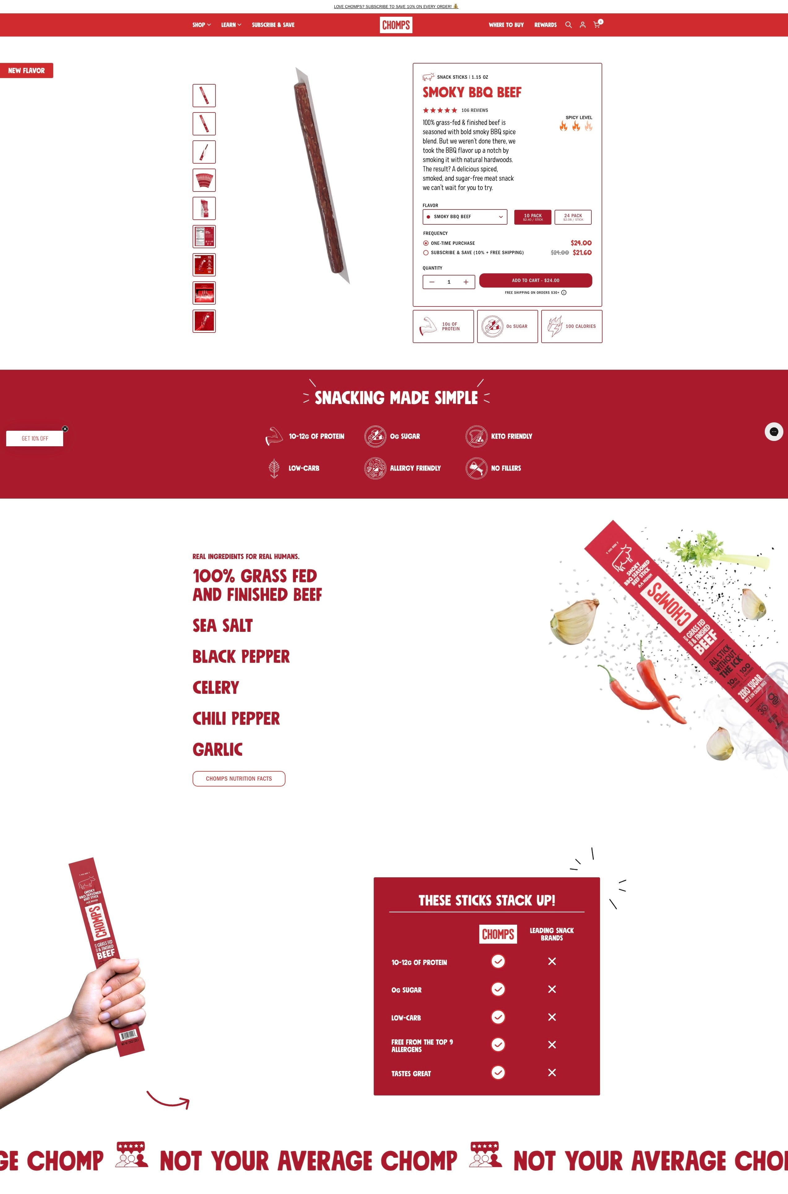
Finding a satisfying snack online can feel like rolling the dice - especially when shoppers can’t verify freshness or taste the flavour beforehand. Without the ability to see, smell, or sample the product in real life, many customers are left with nagging doubts: Is this really as healthy as it looks? Are the ingredients trustworthy? Those lingering questions lead to abandoned carts and second thoughts, as people hold back on purchases they’re not 100% sure about.
To ease those worries, Chomps turned its product detail pages into a virtual “taste test,” building trust through absolute clarity. Detailed ingredient lists, colorful graphics, and straightforward explanations highlight exactly what’s inside every snack - no hidden chemicals, no mystery additives. Helpful cues like certification badges and sourcing notes make it crystal clear how each product aligns with health and quality standards. It’s not just facts and figures, either: a conversational tone reassures customers they’re in good hands, making the online buying process feel more human and less like a gamble.
Armed with thorough, easy-to-digest information, shoppers feel confident about clicking “Add to Cart.” Fewer anxieties mean fewer hurdles to completing a purchase, translating to a smoother experience that leaves customers pleased rather than apprehensive. By addressing concerns right on the product page, Chomps fosters stronger connections with buyers who appreciate the transparent peek behind the curtain. The outcome is simple but powerful: customers stick around longer, come back more often, and spread the word about a brand they can genuinely trust - one snack at a time.
Subscriptions, Simplified
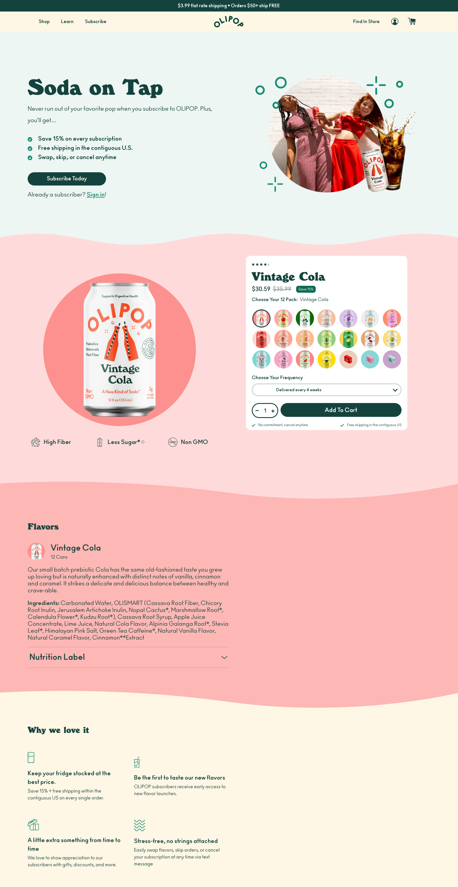
For fans who’ve come to love OLIPOP’s refreshingly unique flavours, running out at the wrong moment can be a real letdown. Without a convenient, ongoing purchase method, they’d have to manually reorder, which quickly becomes a chore in the midst of busy schedules. Competing beverage options are everywhere, and even a minor inconvenience might tempt people to try something new instead. This leaves OLIPOP vulnerable to lost momentum and disengaged customers - simply because placing that next order felt like one step too many.
OLIPOP addressed this issue by introducing a flexible subscription option that virtually eliminates hassle. Instead of making one-time purchases over and over, customers choose their favourite flavours, set up an automated delivery schedule, and relax as new shipments arrive at their doorstep. Tweaking an order - whether it’s updating the mix of flavours, pausing for vacation, or switching up delivery frequency - is straightforward. This frictionless approach puts control back in the hands of the consumer, reassuring them that they’ll always have a fresh supply of the soda they enjoy without the burden of constant reordering.
By weaving convenience into the core of its service, OLIPOP strengthens the bond with its loyal following. Subscribers appreciate the reliable supply and easy management of their shipments, forging a deeper connection to the brand. There’s a growing sense of trust and satisfaction that comes from never having to worry about running low on a favourite fizzy drink. Over time, that steady interaction transforms occasional shoppers into devoted fans - people who keep OLIPOP top-of-mind in a market where attention is hard to hold. And in an industry where brand preference can shift quickly, offering a seamless subscription experience helps OLIPOP stand out as more than just a beverage it becomes a reliable part of customers’ everyday routines.
Social Proof That Matters
Partake Foods’ Honest Social Proof That Builds Trust
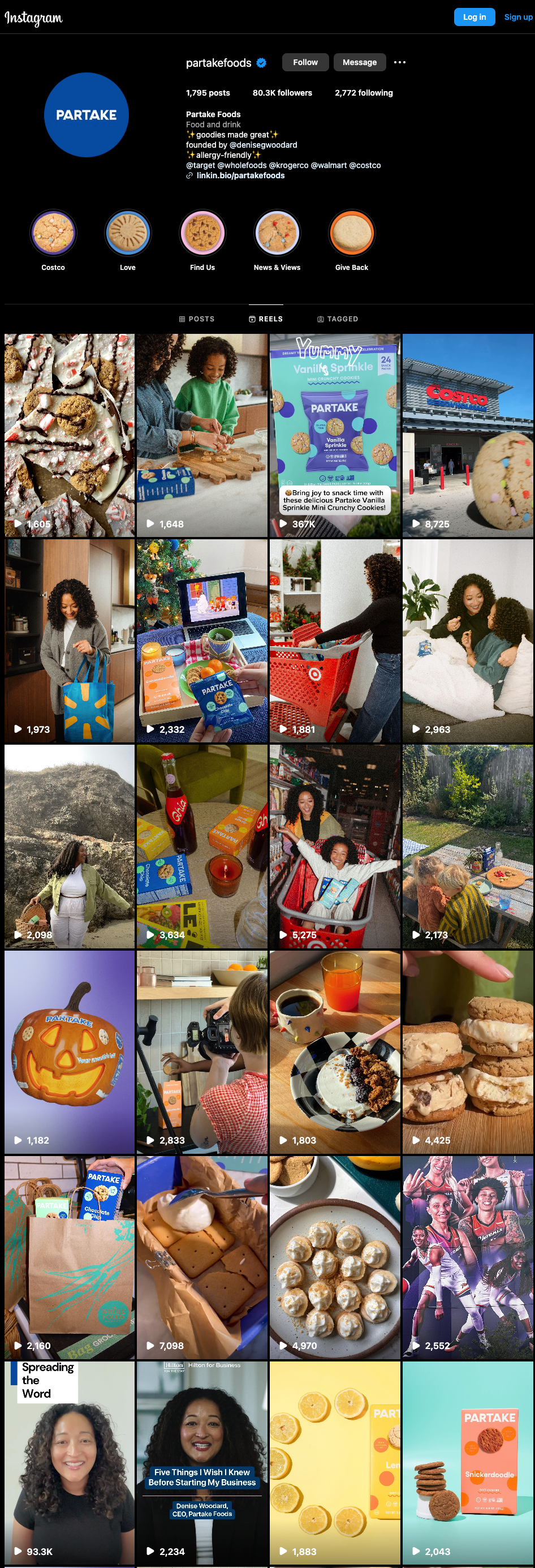
For a brand promising delicious, worry-free treats, first impressions matter - especially online. Without the ability to sample anything in person, prospective customers naturally wonder if products will truly meet their expectations. Partake Foods tackles this uncertainty head-on by showcasing rich, vivid imagery of real people enjoying their cookies on social media, demonstrating that “health-conscious” and “allergy-friendly” can also be fun, flavorful, and full of variety.
A quick scroll through Partake Foods’ Instagram feed reveals a tapestry of real-life moments - families snacking together, college students savouring a sweet study break, and office workers reaching for a comforting afternoon pick-me-up. The feed is peppered with user-generated photos and videos, often reposted from enthusiastic fans who tag the brand, alongside posts featuring the founder, Denise Woodard, and partnerships with major retailers like Costco, Target, and Whole Foods. By spotlighting these genuine scenarios, Partake Foods provides immediate visual proof that their cookies are not only safe for different dietary needs, but also genuinely enjoyed across all walks of life. By leveraging Instagram features - Reels, Stories, and Highlights - they offer short, snack-able videos and behind-the-scenes clips that capture real-time feedback or share personal stories, helping to put potential buyers at ease.
Moreover, by consistently featuring positive reviews, relatable testimonials, and snapshots of everyday cookie moments, Partake Foods closes the distance between brand and consumer. Each new post or reel amplifies the voices of satisfied customers, helping newcomers see themselves as part of this vibrant community. That sense of inclusivity and reassurance is crucial when addressing potential doubts, particularly about flavor and dietary compatibility. When browsers see families, office teams, and college students happily enjoying the cookies in visually captivating posts, it becomes easier to imagine adding that same enjoyment to their own day. In this way, social media transforms curiosity into confidence, drawing in new fans and strengthening the bond with returning customers through authentic, shared experiences.
Build-a-Box Innovation
Magic Spoon’s ‘Build a Box’ Brings Back Excitement
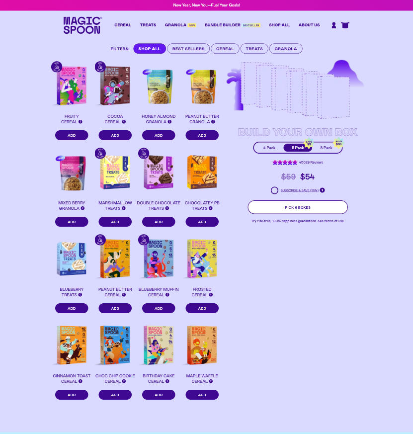
In a market packed with competing breakfast choices, it’s easy for shoppers to feel overwhelmed. Picking just one flavour from a large cereal lineup can lead to hesitancy - some people may buy too many boxes they’re unsure about, while others may postpone their decision and leave empty-handed. Without a tailored solution, shoppers risk getting stuck in a cycle of indecision that keeps them from truly enjoying their first meal of the day.
Magic Spoon tackled this head-on by introducing a “Build a Box” option, giving customers the freedom to select exactly the flavors that excite them. This approach transforms the purchase journey into a fun, DIY experience: each shopper curates their own cereal assortment based on personal tastes or curiosity about new flavours. By letting people blend different varieties in a single bundle - rather than forcing them to pick from a limited set - Magic Spoon removes much of the doubt that can prevent a sale.
Customers benefit from the excitement of crafting a breakfast lineup that feels tailor-made. Rather than being locked into a standard combo, they can mix and match whatever sparks joy - or satisfies a particular craving. This sense of control often leads to larger orders, as shoppers find it easier to justify adding an extra flavour or two to their custom bundle. Meanwhile, Magic Spoon wins by fostering a deeper connection with its audience. Each transaction becomes a small adventure, encouraging repeat visits and nurturing brand loyalty. The net effect is a positive feedback loop: customers are thrilled with their personalised cereal boxes, and the brand strengthens its position by offering a shopping experience that’s both practical and delightful.
Visual Storytelling in Action
Jimmy Joy’s Visual Feast
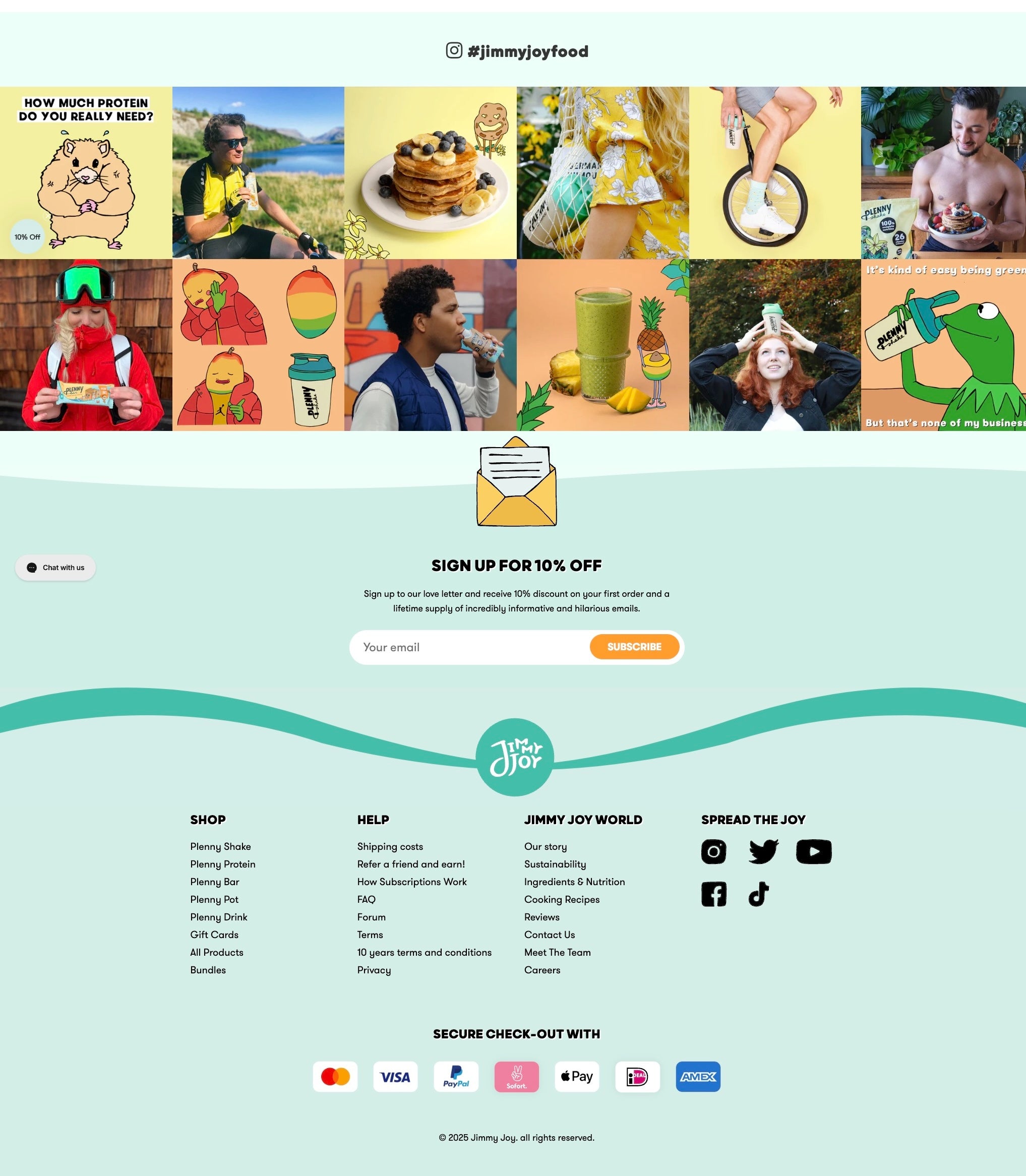
For an online food brand like Jimmy Joy, the inability for customers to taste or smell the products before buying can spark hesitations. Without appealing visuals that highlight freshness and quality, prospective buyers may question whether the meals will truly satisfy their cravings - or even if they’re safe to consume. This gap in sensory assurance can cause many to abandon their purchase, halting trust before it ever has a chance to form.
Jimmy Joy addressed this challenge by prioritising high-resolution, appetising images that capture every vibrant colour and texture of their shakes, bars, and meals. Rather than relying on plain product shots alone, they feature real people genuinely enjoying each bite or sip in everyday scenarios. These carefully composed photos not only emphasise the actual look of the food but also convey an authentic, relatable experience - bridging the gap between seeing the product online and imagining its taste.
With vivid images showing enticing details and real enjoyment, customers feel more confident and excited about ordering. Prospective buyers can picture themselves savoring each meal, which boosts trust and lowers hesitation. The brand’s emphasis on quality visuals also contributes to an overall feeling of professionalism and transparency, inviting both new and returning customers to explore the product range with genuine enthusiasm.
Guided Product Discovery
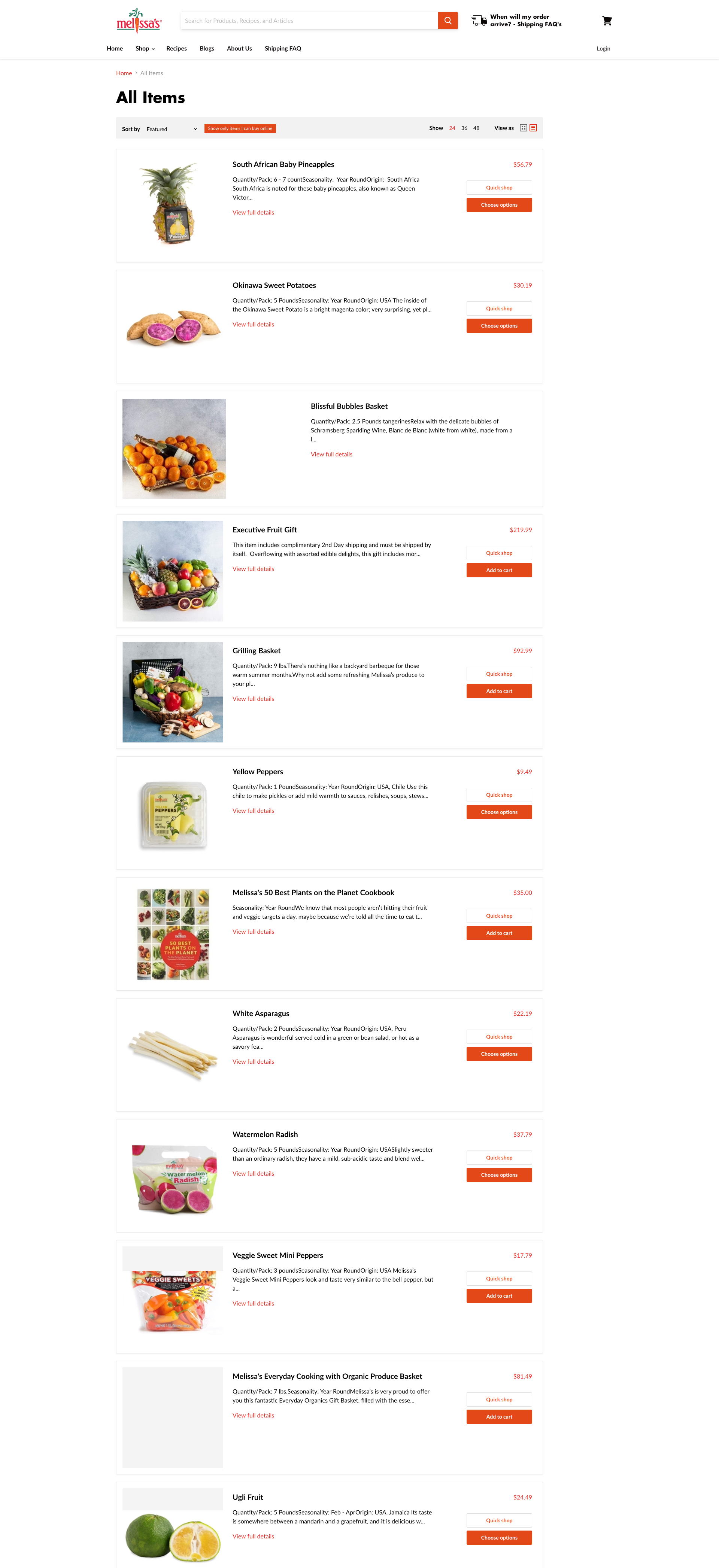
Imagine scrolling through a dizzying array of fresh fruits, vegetables, and specialty items - each more interesting than the last. While this variety can be exciting, it can also leave shoppers feeling unsure about where to begin or which option best suits their needs. Without a clear guide or organisational structure, customers might waste time searching for that perfect item or, worse, abandon their carts entirely if the process becomes too overwhelming. For a brand that prides itself on offering everything from everyday essentials to exotic finds, losing a customer’s interest due to information overload is a challenge worth solving.
Melissa’s Produce appears to address this issue by creating a user-friendly online shopping experience designed around clear categories and intuitive navigation. Rather than making people sift through one long list of produce, the site breaks down items into manageable sections - like seasonal highlights, popular picks, and even chef-curated recommendations - so shoppers can quickly spot what intrigues them most. Tools like a mega menu put all relevant sections in plain sight, transforming a massive inventory into a neatly labeled virtual produce aisle. This approach reduces guesswork, guiding customers straight to the items they’re seeking, whether it’s a basic bunch of bananas or an exotic fruit for a special recipe.
By simplifying the product discovery process, Melissa’s Produce reaps multiple benefits. Shoppers likely spend less time feeling lost and more time exploring new and unexpected finds. They can glide from category to category, discovering meal ideas and combinations they might never have considered otherwise. The overall effect is a smoother shopping journey - one that builds confidence and encourages repeat visits. With fewer barriers to finding the perfect produce, customers end up with a sense of satisfaction and excitement about their purchases, while Melissa’s Produce earns trust and loyalty by making each browsing session a breeze.
A Bold Voice That Resonates
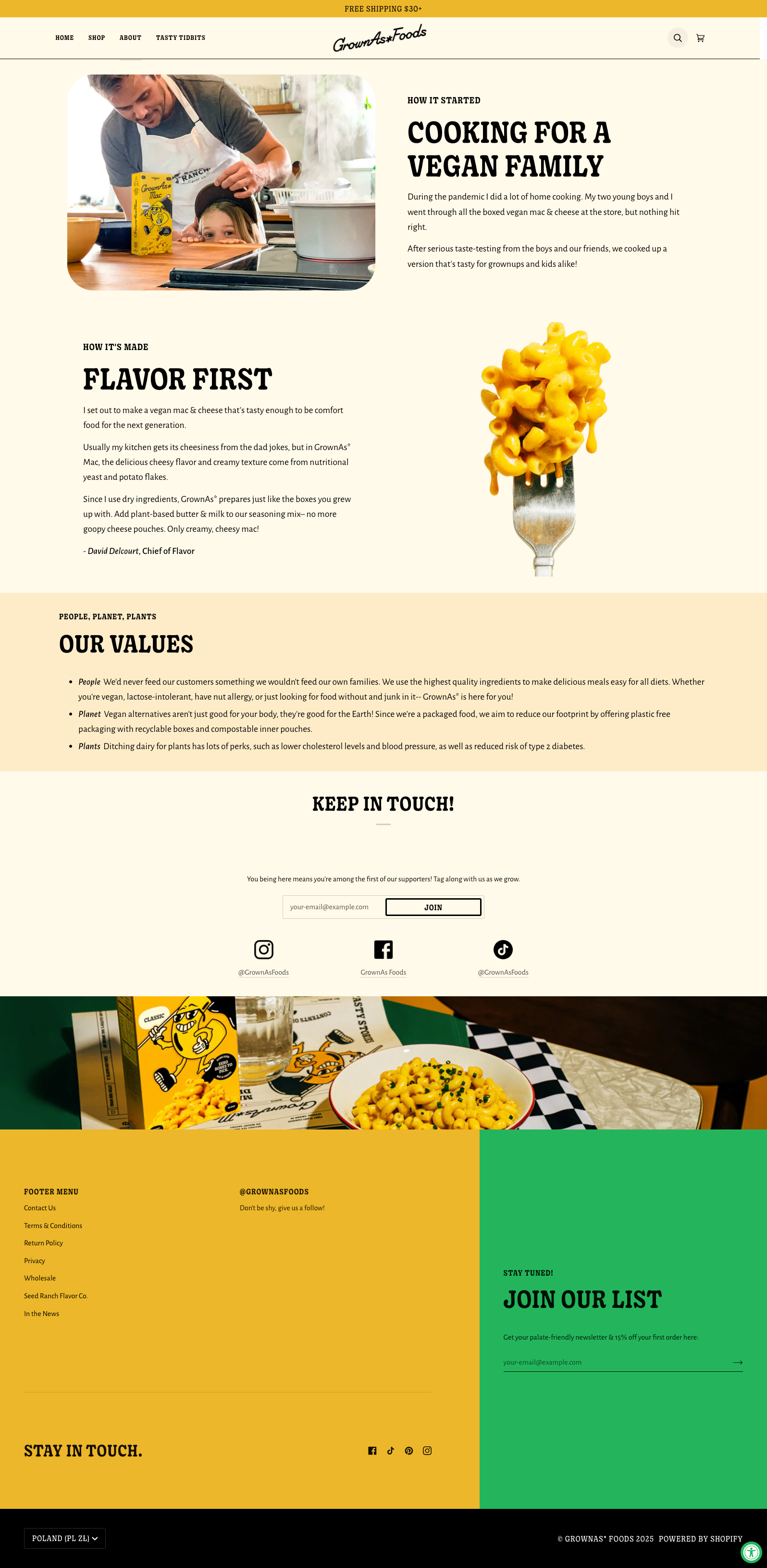
In a crowded food aisle, an inconsistent or forgettable look can cause a promising product to go unnoticed. If shoppers can’t instantly recognise a brand - or don’t see how it aligns with their personal values - they may move on to a competitor with more visual and emotional appeal. Without a cohesive brand identity, even high-quality ingredients and mouthwatering flavours can get overshadowed by the noise of the marketplace.
Grown as* Food addressed this head-on by crafting a distinctly bold and authentic visual narrative. Every package, social media post, and store display features the same lively color scheme, playful typography, and quirky illustrations, making it easy for customers to spot the brand at a glance. This intentional consistency also reinforces the company’s core message: it’s not just about great taste, but a product that stands for something. By weaving storytelling into every touchpoint, Grown as* Food draws in shoppers who appreciate transparent values and a brand personality that feels real.
Thanks to this clear, unified identity, Grown as* Food stands out in shoppers’ minds long after they leave the store. Customers who connect with the brand’s spirited approach - and trust its commitment to quality - are more likely to remember it when it’s time to restock their pantries. This deepened recognition cultivates loyalty, as people become eager to share a product that looks, feels, and tastes in line with their personal standards.
Smart Bundling, Bigger Carts
How Catalina Crunch Perfected the Art of Bundling
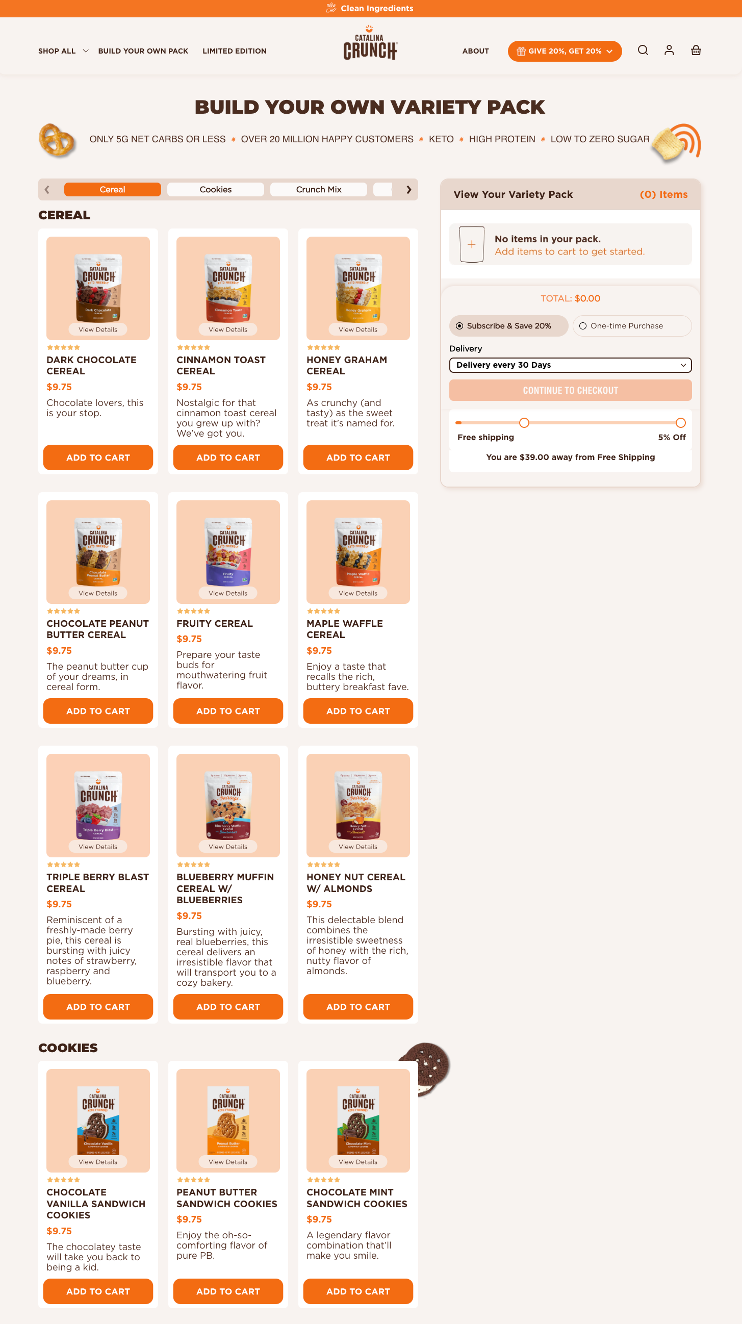
With so many flavours vying for attention - chocolate, cinnamon, fruity blends, and even seasonal surprises - customers can quickly feel overwhelmed. They might debate for ages which single item to purchase, or worse, abandon their carts altogether out of indecision. From an outsider’s perspective, it’s easy to see how this indecision could lead to missed opportunities for Catalina Crunch. If people aren’t confident in their choices, they might stay stuck in limbo, ultimately choosing nothing at all.
Catalina Crunch alleviates this dilemma by allowing shoppers to bundle multiple flavors into a single, discounted package. Rather than forcing anyone to commit to just one flavor, the brand offers the freedom to mix and match. This curated approach takes the guesswork out of trying new products - customers can explore multiple flavours in one order without breaking the bank. By framing it as a ready-made “bundle box,” Catalina Crunch provides convenience and excitement in each purchase, ensuring no one has to leave the site feeling uncertain or unfulfilled.
From an outside vantage point, this bundling strategy appears to benefit both the brand and its customers in several ways. Shoppers get to sample a broader range of items, which can spark repeat visits as they discover new favorites. The brand, in turn, sees higher overall order values because people are more inclined to add additional products when they feel they’re getting both variety and value. Perhaps most importantly, the act of bundling helps reduce the anxiety of choice, which can strengthen shoppers’ confidence and encourage them to come back for more. By simplifying the decision-making process and boosting the fun factor, Catalina Crunch effectively turns a once-overwhelming flavor selection into a feature that delights loyal fans and newcomers alike.
Bringing all these lessons under one roof can feel like a tall order - until you see how naturally they connect. Chomps shows us the power of quick, to-the-point product detail pages, while GrownAs Foods reminds us why a brand’s voice is everything. OLIPOP’s streamlined subscriptions demonstrate that recurring orders don’t have to be complicated, and Jimmy Joy proves that the right imagery can spark genuine excitement. Add in Partake Foods’ social proof, Magic Spoon’s customisable bundles, Catalina Crunch’s balance of pre-made and build-your-own sets, and Melissas Produce’s well-organised navigation, and you’ve got the blueprint for a food and beverage site that’s ready to thrive. Each of these strategies supports the others - together, they form a cohesive, shopper-first experience that makes people want to click “add to cart” again and again.